Creating an instructor-led eText experience
end-to-end content strategy • microcopy • taxonomy • cognitive load reduction
Context
Pearson+ is a web and mobile app for higher-ed students that lets them rent the digital textbooks they need for class.
It comes with useful features like audio playback and an AI textbook expert, plus some optional add-ons like advanced study tools.
The goal: let instructors in on the action
Our instructors want to use the same ecosystem as their students, but Pearson+ has never had an instructor side. Our goal for this project was to create an educator-led version of Pearson+ that:
Can be adopted by instructors via their LMS (Learning management system, ex. Canvas or Blackboard)
Lets instructors assign readings and lightweight assignments
Provides real-time, actionable performance data
Of course, that also necessitated some key updates to the student side of Pearson+. This instructor-led version needed to:
Be purchasable by students with an instructor-provided link
Insert assigned reading sections and AI-generated questions into the student experience
Give students the ability to track their own progress
My role
I worked fully end-to-end as the lead content designer, leading users from purchase through to the end of the semester in all geos (US, UK, Europe, AU, and NZ). To give you a (very rough) idea of the scope, that included:
Unique product description pages
Checkout flows and LMS integration
Legal disclosures
email touchpoints
FAQs
Instructor and student adoption
Instructor assignment creation
Instructor performance data dashboards
Student assignment completion flows
Student results dashboards
This is a massive project and too large to fully cover here. Instead, I’ll be breaking out a handful of the problems I solved.
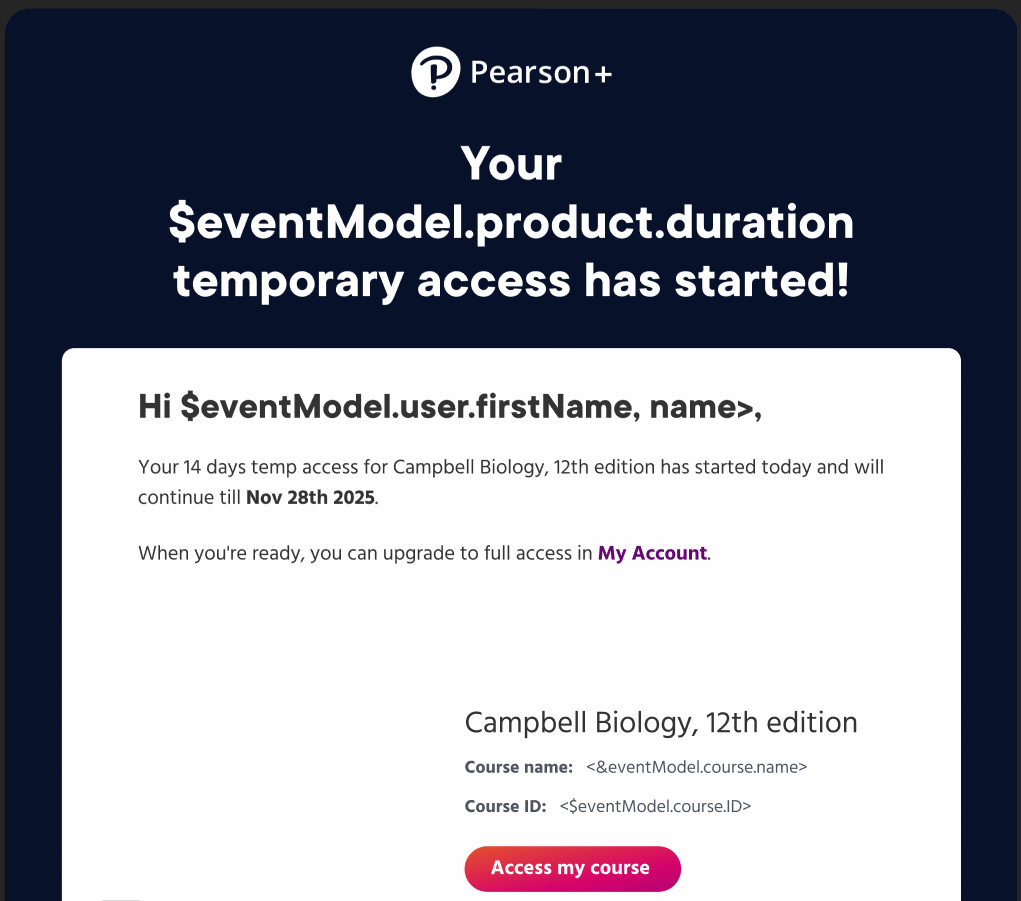
Problem 1: how can we help students who are dependent on student aid?
Now that instructors can require a specific eTexbook and integrate it with their LMS gradebook, we needed to make sure that all students–even those waiting on student aid checks–can start their assignments on day one.
Because of another product I work on, I knew the company had offered temporary access before and suspected a similar solution could work here. Plus, since students would need a link from their instructor to reach their unique product description page, abuse wasn’t likely. After confirming all this with the project’s PM, the UX designer and I worked out what this would look like.
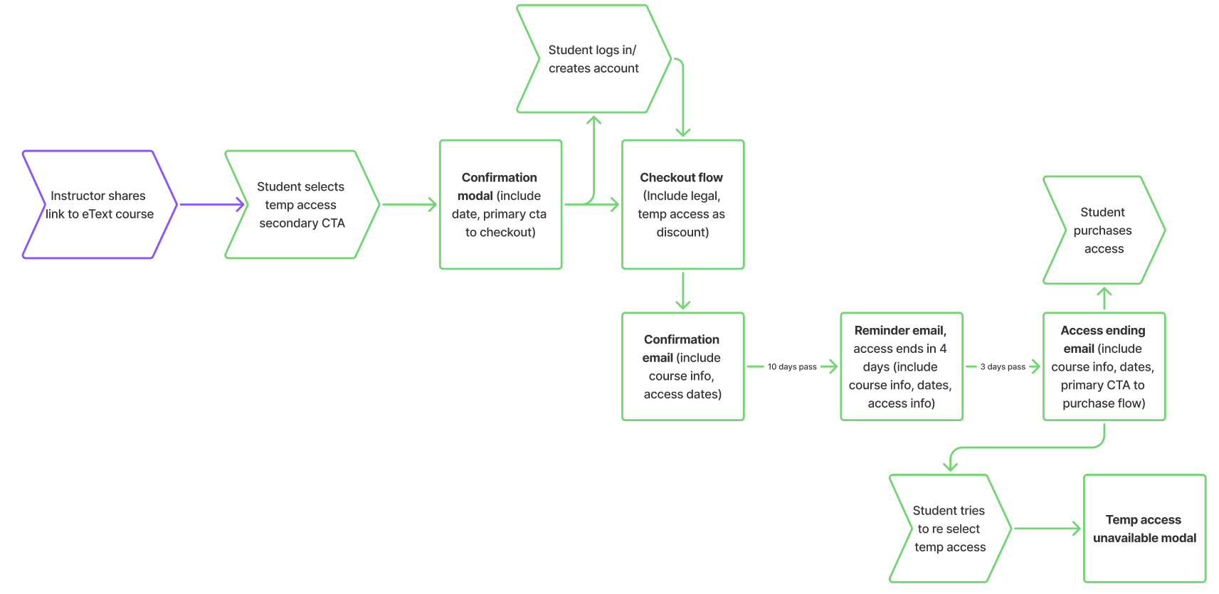
Once we had approvals from all stakeholders, I got started on language.
There was a wrinkle, though.
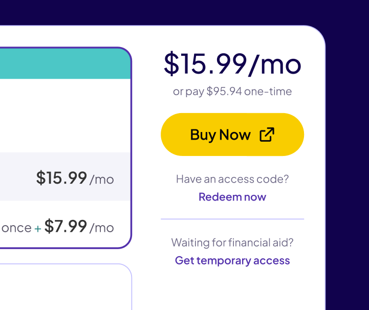
As it turned out, because it was also technically possible for students to pre-purchase their eTextbook access from their college bookstore, our CTA for temporary access needed to be bumped down to a tertiary CTA.
It’s not ideal, but to keep things looking as clean as possible, the designer and I opted to de-emphasize the secondary and tertiary CTAs
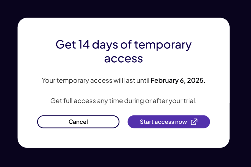
On the upside, that gave me just enough room to call out exactly which students this CTA was for.
For the rest of the content in this flow, I leaned on what we knew about our users.
This user is likely worried about how they’ll access their course materials and a little overwhelmed by the start of classes. Because of that, I opted to keep our messaging short and clear throughout the rest of the flow. You can see a few examples below.
Problem 2: how do we keep data clear and easy for instructors to parse?
To help instructors, we collect and share detailed student assignment data. However, when reviewing the wireframes, I needed to ask a LOT of clarifying questions about how the data in the dashboards was sourced. I knew that confusion would be passed on to the user if we didn’t have a consistent framework for labels and headers.
Here’s an example.
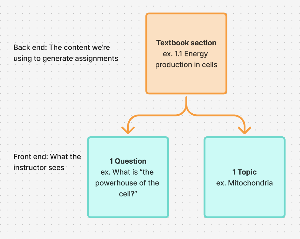
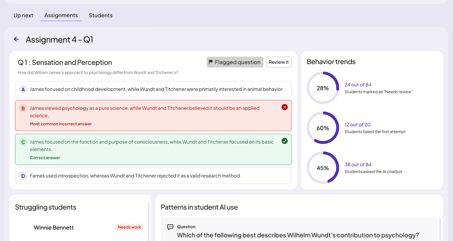
In wireframes, “question” was being used to describe both an item within an assignment AND a short summary of the overall subject. This was because, on the back end, they were being generated from the same source material.
Effectively, there were the same thing—one question covered one topic.
However, we can see the result of that here, where the instructor is viewing how a student performed on a specific assignment. Internally, we knew “Difficult questions” was data from the “Performance” column being presented in a short digest format—but would an instructor make that connection? I didn’t think so.
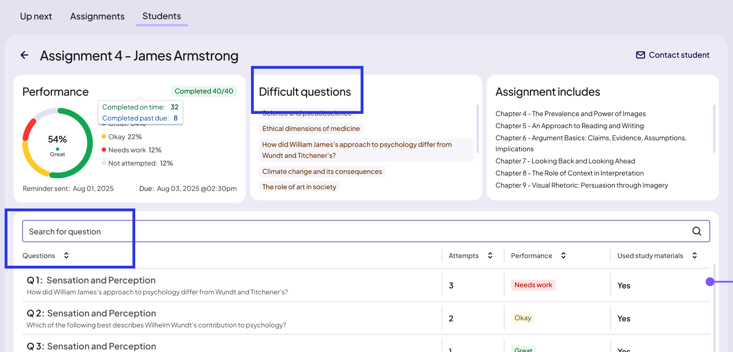
Because there isn’t enough space to make that connection clear, I decided our best option was to make these two data points distinct enough to stand alone. This is how I defined them to the product managers, UX designers and devs when I talked them through my thought process:
Question = a numbered item that sits within an assignment.
Topic = the subject of a question or a section of text.
So “Difficult questions” in the above screenshot became “Difficult topics.”
While specificity was the key to clarity here, in another instance it was working against us.
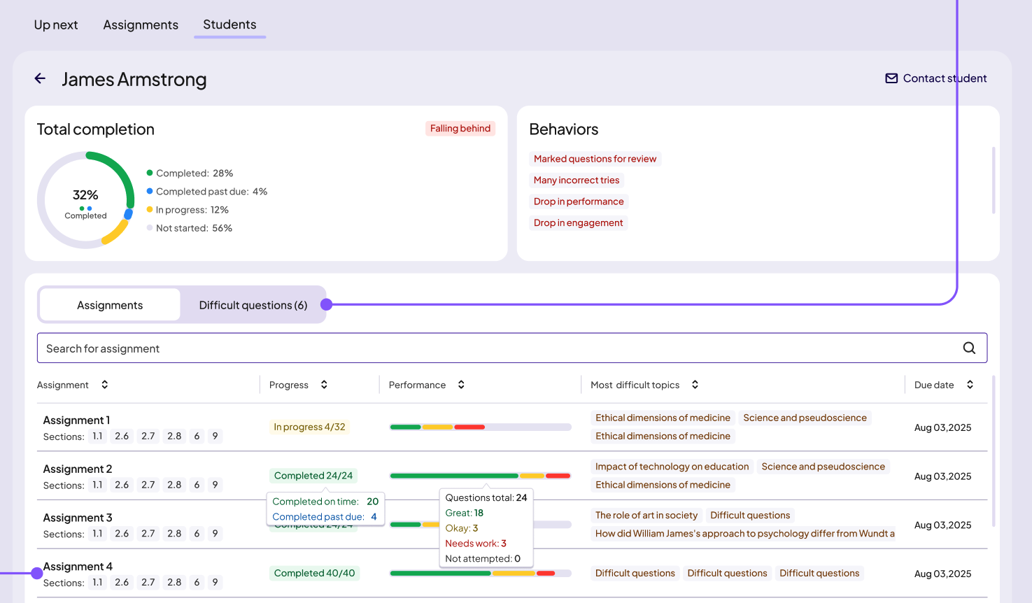
At the student level and the whole assignment level, product management was using “risk factors” to describe big-picture trends in how individual students interact with their assignments.
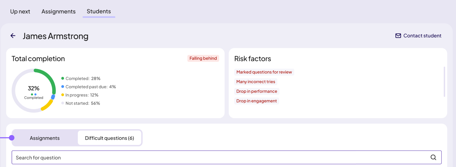
Even though it was accurate in that we were mostly tracking negative trends for launch, I worried about 2 things.
“Risk factors” is prescriptive. Instructors with different teaching styles may not agree on what a risk factor is.
It’s not future-proof. There’s no room to include neutral or even positive trends as the product grows.
I wanted to bring a solution when I raised these issues with product management, so I started brainstorming on my own before taking some of my ideas over to Claude, where I told the AI it was a college professor and had it help me narrow down further.
The labels I settled on were “behaviors” for individual students and “behavior trends” for aggregated student data, the latter of which you can see here, in the screen that breaks down how the entire class handled a question.
Problem 3: how can we align the student and instructor language while keeping the user goals distinct?
From the very beginning, it was clear to me that the language on both sides of the product needed to align so that students and instructors would be able to use a shared vocabulary when discussing coursework. This was tricky, though, as these are two very different groups of users. You can see that if we revisit our project goals:
For instructors, we should provide the data they need to adapt their in-class instruction.
For students, we should give students an idea of their progress and encourage deeper interactions with the course material.
A place I really needed to get this right was the way we labeled performance. Once an assignment is completed, each question/topic gets tagged with a good/neutral/bad label. Those labels needed to:
Make sense to both instructors and students
Be flexible enough to make sense in multiple contexts
Be short
Be nonjudgmental
I found pretty quickly that this was harder than it seemed. I went through several rounds of brainstorming, and this time I took multiple sets of options to the product managers and the UX designers. Because this would impact the user experience on so many screens, I knew it was important to get a consensus.
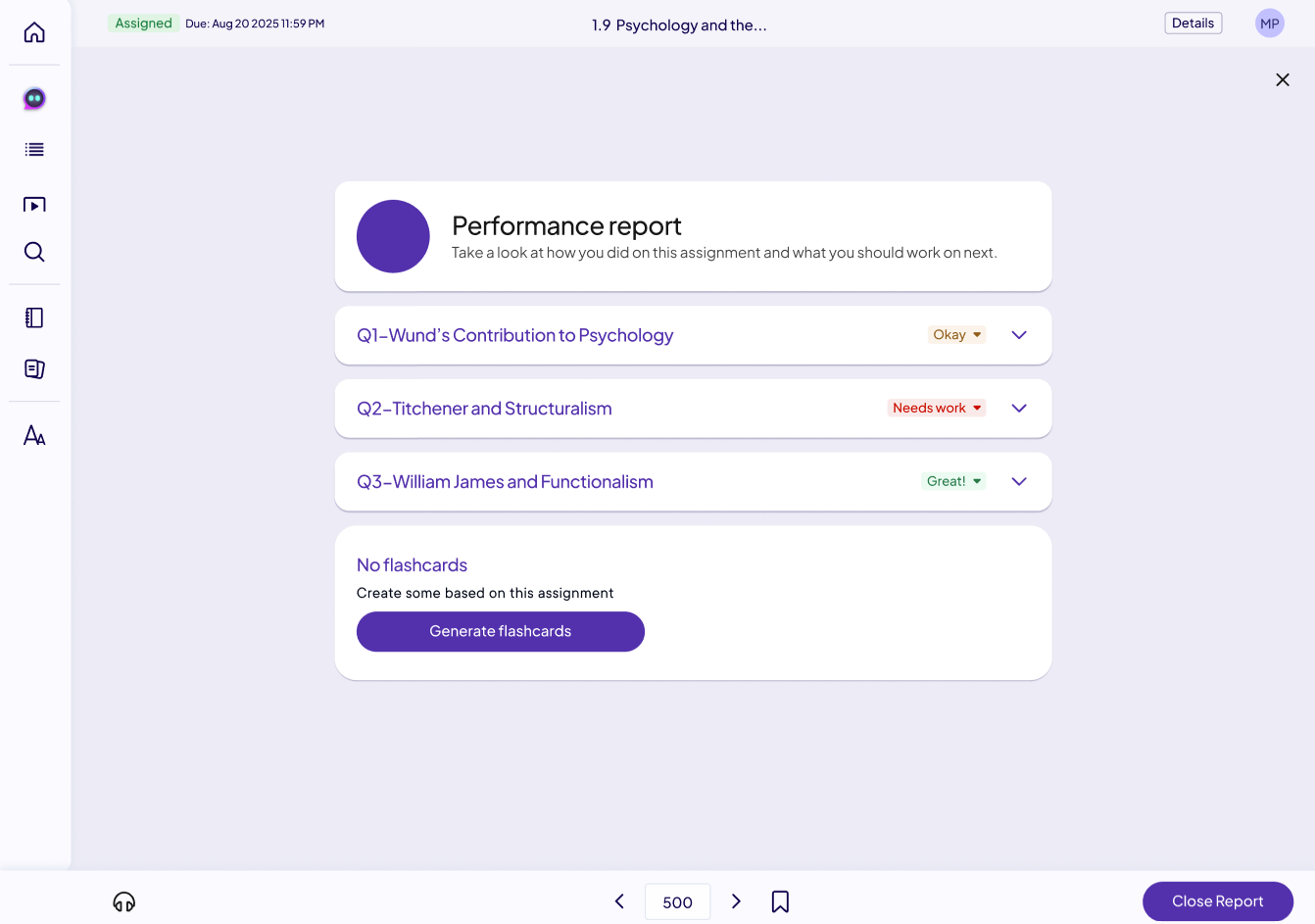
After several discussions, we landed on Great, Okay, and Needs work. Here is how that worked in the instructor dashboard:
Next is how student would first encounter these labels: in the performance report that shows immediately after finishing the assignment in their eTextbook. Worth noting is that students have control over these labels on their end—if they don’t feel confident in a question/topic they aced, they can change the label to tag it for review.
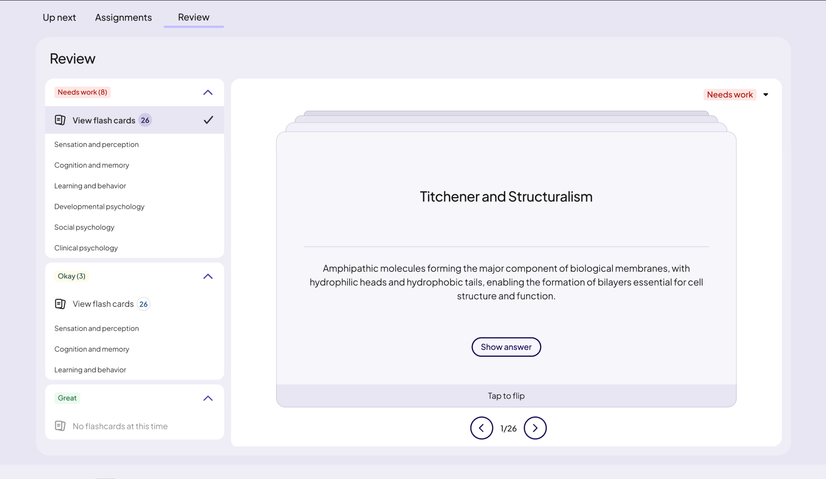
Here in the review section of the student dashboard, you can see these labels in yet another context—as a way to sort study materials.
The results
I didn’t initially mention this, but while this would have normally been planned as a 6-month project, we had just 2 to get this built and launched in time for spring semester. Frankly, I count an on-time delivery as a massive win, for both myself and the UX designers, devs, and product managers (not to mention the legal, marketing, and international teams) I worked with.