Simplifying mobile sign in
mobile content design • ux writing
Context
Pearson+ is a web and mobile product for undergraduates. Its key feature (and main source of users) is its eTextbook reader.
The problem: missing eTextbooks
Because of the way Pearson accounts work, it’s possible for a user to not actually know their username or password.
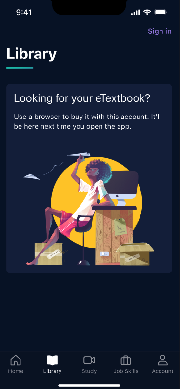
This meant that users trying to use the mobile app were creating fresh accounts, only to be met with an empty library tab and a (seemingly) missing eTextbook.
While this didn’t impact their web experience, it did make it extremely frustrating to log into the Pearson+ app, which resulted in higher support calls and lower app usage.
The process
I worked with a UX designer and product manager from wireframe to testing as we mapped out the least confusing way to message a multi-step process.
After taking our set of wireframes to developers to make sure it was possible, we settled on a lean flow that worked.
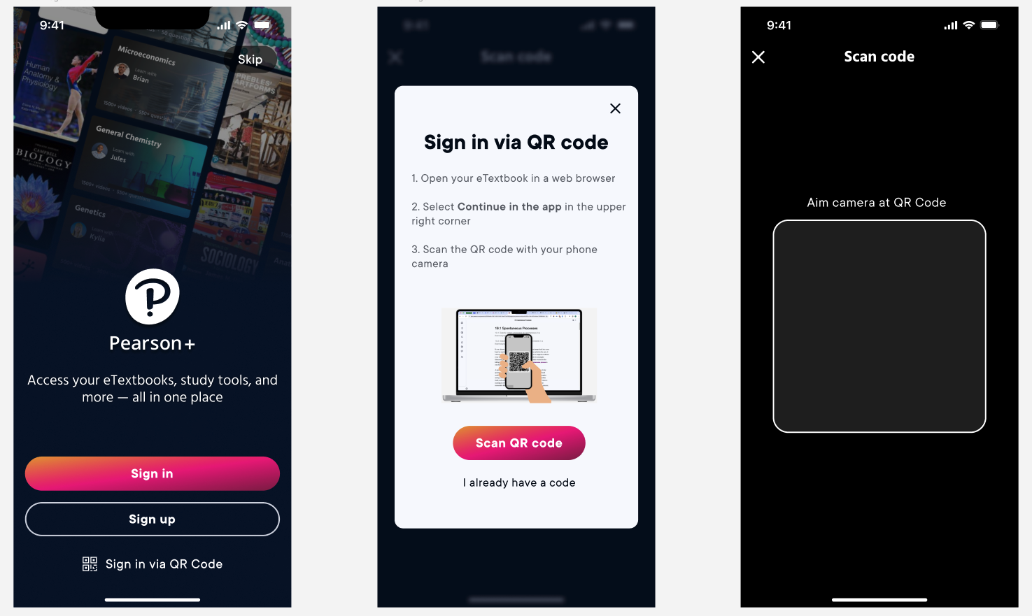
Now, a user with the app who doesn’t know their login information can select the tertiary CTA and use a QR code from their web instance to authenticate their account.
Once they’re ready, the user can open the web experience and select the option to “Continue in the app,” which always available in the upper right hand corner, as seen here in the reader:
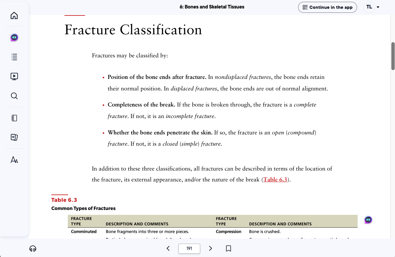
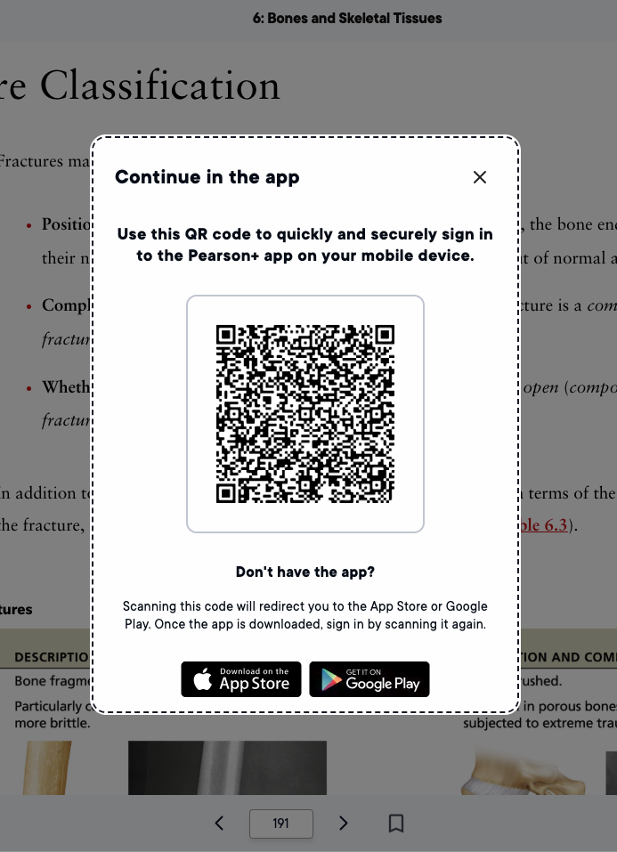
That CTA launches a modal with the QR code that will complete their sign in.
The best part?
This flow works in reverse for users who don’t have the app already downloaded—a user in a web instance can click “Continue in the app” and the QR code will take them to the app store, before then taking them to log in.
The results (and what I would change)
In hindsight, I’d love to cut a few more words from this modal—4 lines of body copy is just too much. However, this end result both cut down on calls to support and slightly increased our app adoption, so we know it’s doing its job.