Building an AI learning assistant
conversation design • content strategy • voice & tone
Context
Pearson+ is a web and mobile product for undergraduates. Its key feature (and main source of users) is its eTextbook reader.
The challenge
With a tight deadline, our team was tasked with creating an AI assistant that lives in the eTextbook. It should help users parse lengthy material, break down complex topics, and generate practice questions WITHOUT encouraging cheating, copying, or other anti-learning behaviors.
This was a huge initiative powered by a team of researchers, product leaders, learning designers, devs, and UX designers.
My contributions
As the only content strategist on this project, I supported the team in 3 main ways:
Providing voice and tone recommendations as the AI was trained. This covered things like word choice, grammar, and personality.
Helping designers fine-tune UX copy in the AI interface and decide what to call certain features.
Working with the product team to define the user requests that would generate a hard-coded response from the AI (then, writing those responses).
Exploration
While the team ramped up, I spent a lot of time playing with other AIs to get a feel for how they might color our users’ expectations. A particularly helpful one was Khanmigo, from Khan Academy. Not only do they operate in a similar industry, but their AI was already in a public beta.
Fine-tuning microcopy
I did many (many) passes on the design’s UI throughout this project, and we’re still fine-tuning to this day. Here are a couple examples.
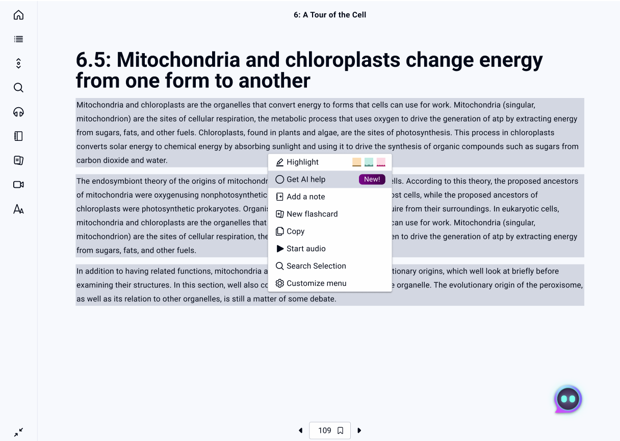
First up, one of the primary ways a user can launch the AI is by highlighting a section of text and choosing the AI option from the menu. We needed copy that conveyed the main function of the AI while fitting in with the menu as a whole. This is where I landed:
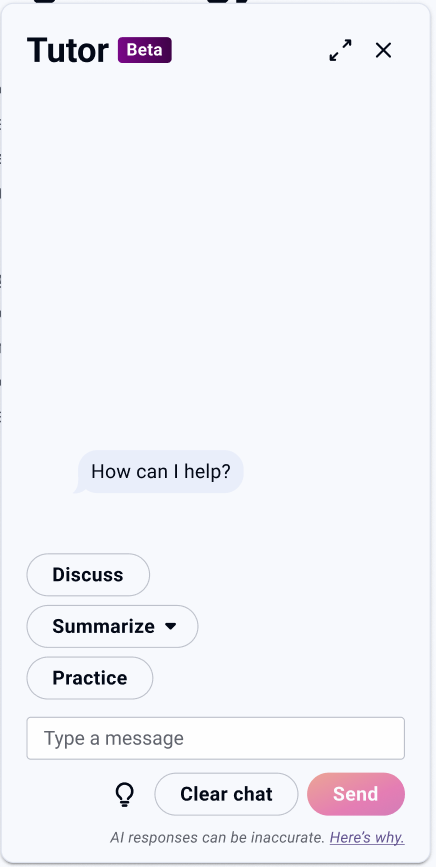
Next, from the very beginning we knew we wanted to build in quick options.
On the left is an early wireframe with the 3 options we initially tested. “Summarize” and “Practice” are both pretty self-explanatory. The first generates high-level overviews and the second generates practice questions based on selected topics or sections.
“Discuss,” however, wasn’t working for users. Research showed that we needed an option that was the opposite of summarizing or simplifying—something that would take a topic and expand upon it. But “Discuss” seemed very energy-intensive for users. After spending time talking with researchers and product, I got to work mapping out options and narrowing down my preferences. Eventually I recommended “Explain,” and testing showed it made a significant improvement.
Before
After
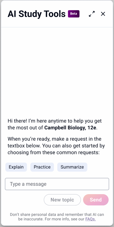
These screens also show off a big change we made to the secondary CTA. “Clear chat” proved intimidating to users who didn’t realize that this was more of a reset button than a delete button. In the end, I advocated for “New topic,” which is forward-looking and gives the user a sense of control over what happens next.
Introductions and dead ends
For a whole host of reasons–some business, some legal, some technical–there were certain interactions that we knew we needed more control over. This meant working with product and the lead designer to build a database of hard-coded responses for our AI to draw from.
For our first release, these hard-coded responses fell into 3 main categories.
Initial interactions with the user
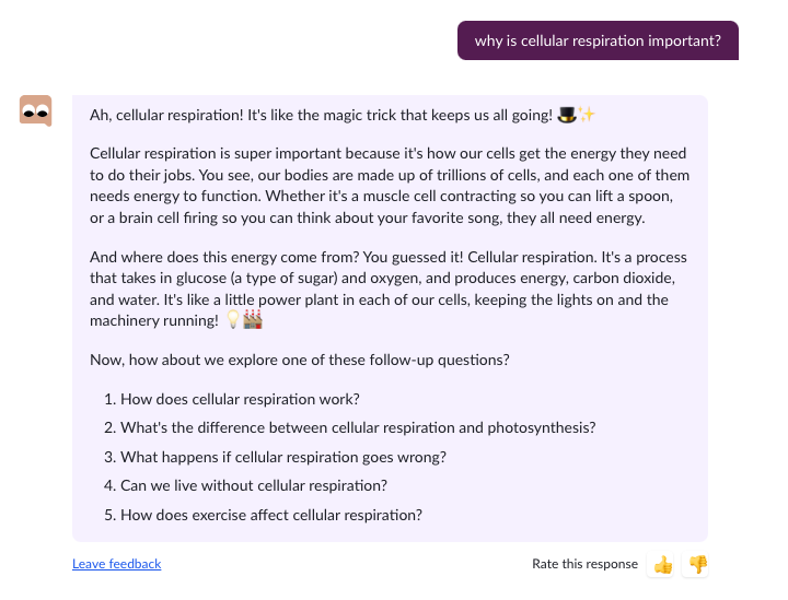
Even though the team and I built a lightweight unboxing that should help orient first-time users, we wanted to make sure that the user never opened up the AI to find a blank screen. You can see our initial welcome message below, as well as how we adapted it for returning users.
A couple interesting things I took away from playing with this as a user:
Structure still matters–despite the customization, longer, unstructured responses were still a chore to get through.
Some kind of goal-setting was a good thing–the more open ended the AI felt, the less likely I was to make good use of it (though admittedly, this may have been a me problem).
New testing also had some interesting results.
While some of our users limit test, most treated the AI as a real person. For me, that meant that in spite of everything I’ve already noted, it was still important to keep the AI sounding approachable and human.
It was a fine line to walk, but in the end I settled on a set of guidelines I could use in the rest of my work.
Defining voice and tone
I also dove back into the research we had on our users and their preferences
While we wanted an AI that felt conversational, we already knew our users didn’t respond well to anything that felt too much like a peer.
On the flip side, it was vital we avoid anything that felt “kindergarten teacher-y.” Our users are young adults who are only in the textbook because they have to complete an assignment or review a concept they’re struggling with. The voice that was working for Khan Academy in the above screen wouldn’t work for us.
Post-launch
As of 2025, the AI Study Tool has over a million users and regularly surpasses our quarterly usership targets. This is very much a living project and I expect to keep working on it and our other AI initiatives for as long as I stay with Pearson.

Responses that solve user-created errors
In the early stages of building the AI, we ran into a LOT of situations that—traditionally, at least—looked like errors. However, the conversational experience meant we were able to guide users through them.
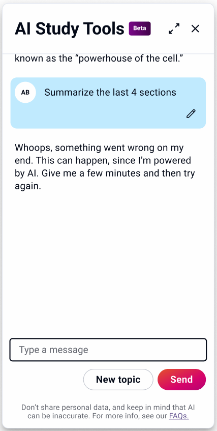
True errors and dead ends
Of course, full-stops still exist in the experience that prevent the user from moving forward. These are issues that the user can’t predict or fix. All we can do is let them know that they’ve done nothing wrong and let them know what their next step should be.
Another interesting challenge was how to handle inputs that contained sexual, violent, or otherwise harmful language.
Initially I planned a matrix of responses organized by type and severity, but as I worked through them, I realized this was one situation where custom, conversational responses might actually work against us.
My gut said that variety might encourage limit-testing users to experiment while confusing the users who could actually benefit from the message.
After consulting with legal and product, we decided to only trigger this response for medium- and high-severity user inputs and to use the same response for each.
First-time user
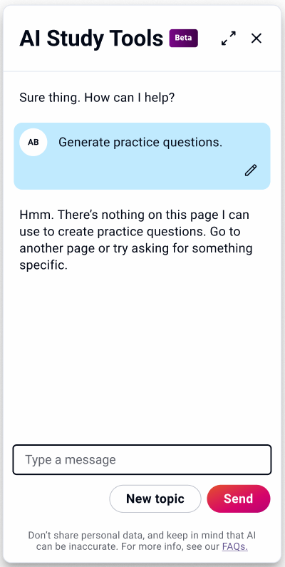
For instance, to generate responses with any of the 3 common request buttons, the AI needs direction.
In most flows, the AI already knows the context, but there are edge cases where it won’t. In these situations, we need to make sure the user understands what the issue is and how to fix it.
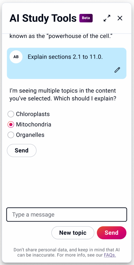
The reverse was also an issue—the AI struggled when a selection was too large. So, if the user selects a third of the book and asks the AI to explain (that is, to expand on a topic), we needed a simple way to communicate the issue and narrow the scope of the request.
Returning user
