Simplifying assignment creation in Revel
content design • ux writing
First, some context
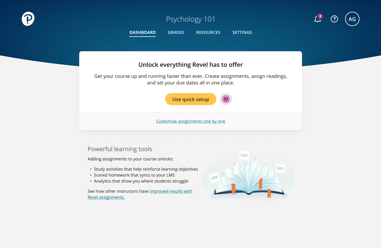
Revel is a web and mobile app for college courses.
Instructors create a course that bundles a digital eTextbook with assigned readings, activities, and study tools.
Here’s a look at the dashboard on the instructor side.

The challenge
Historically, instructors have had to create assignments one by one. This allows for a lot of customization, but it’s time-consuming. Many weren’t assigning anything at all.
Our challenge? Create a simpler way to build courses. Then, show instructors how to use it.
My goals
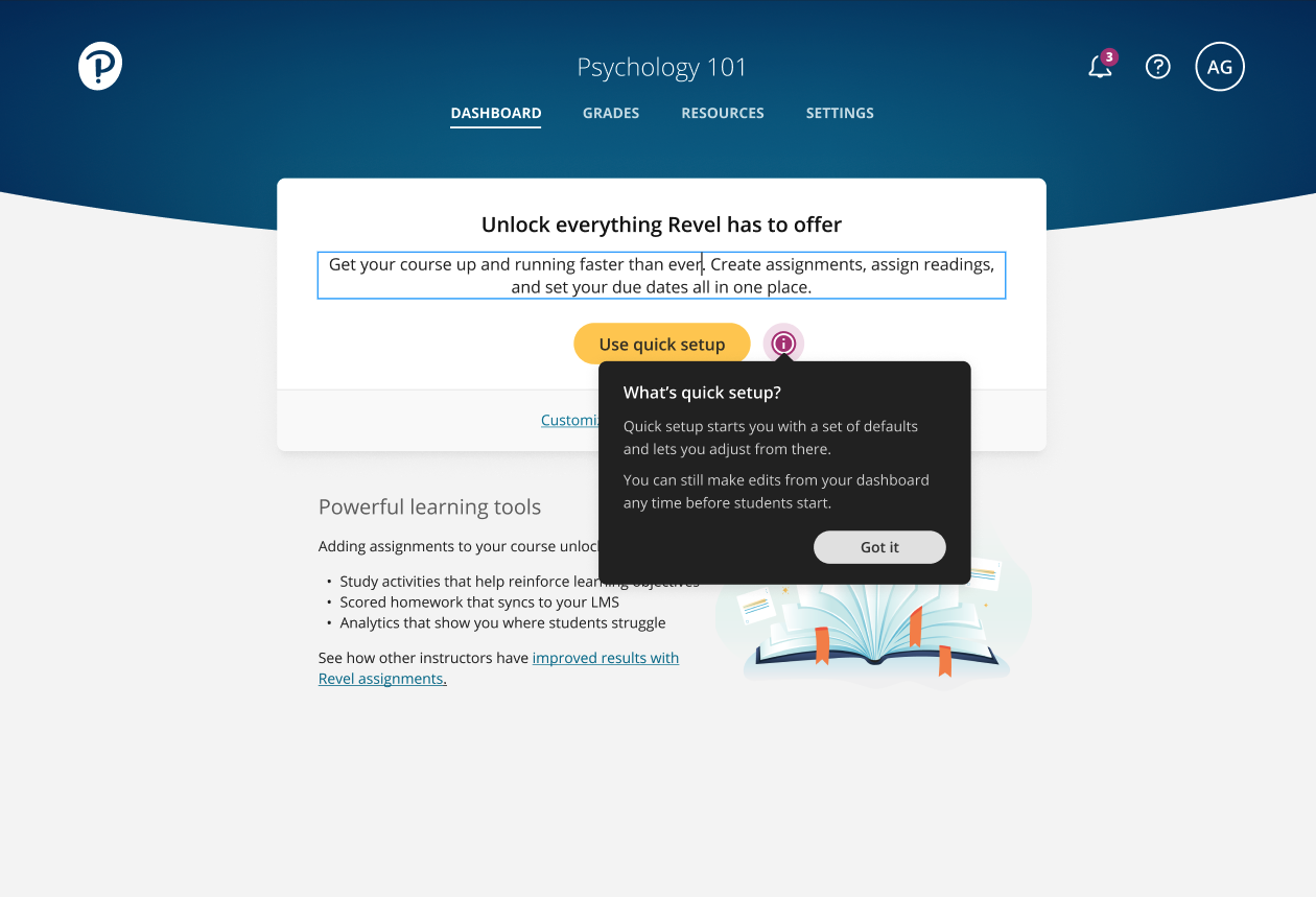
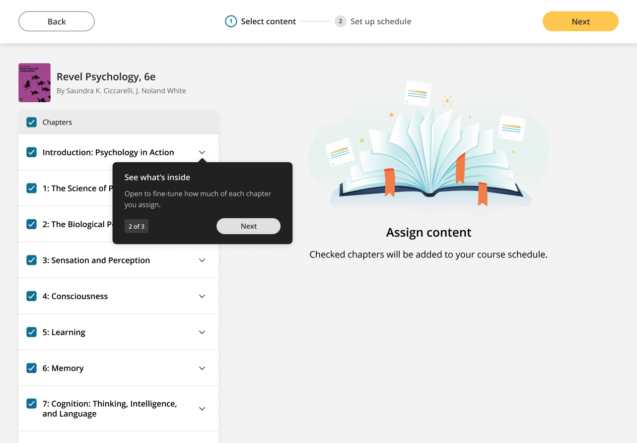
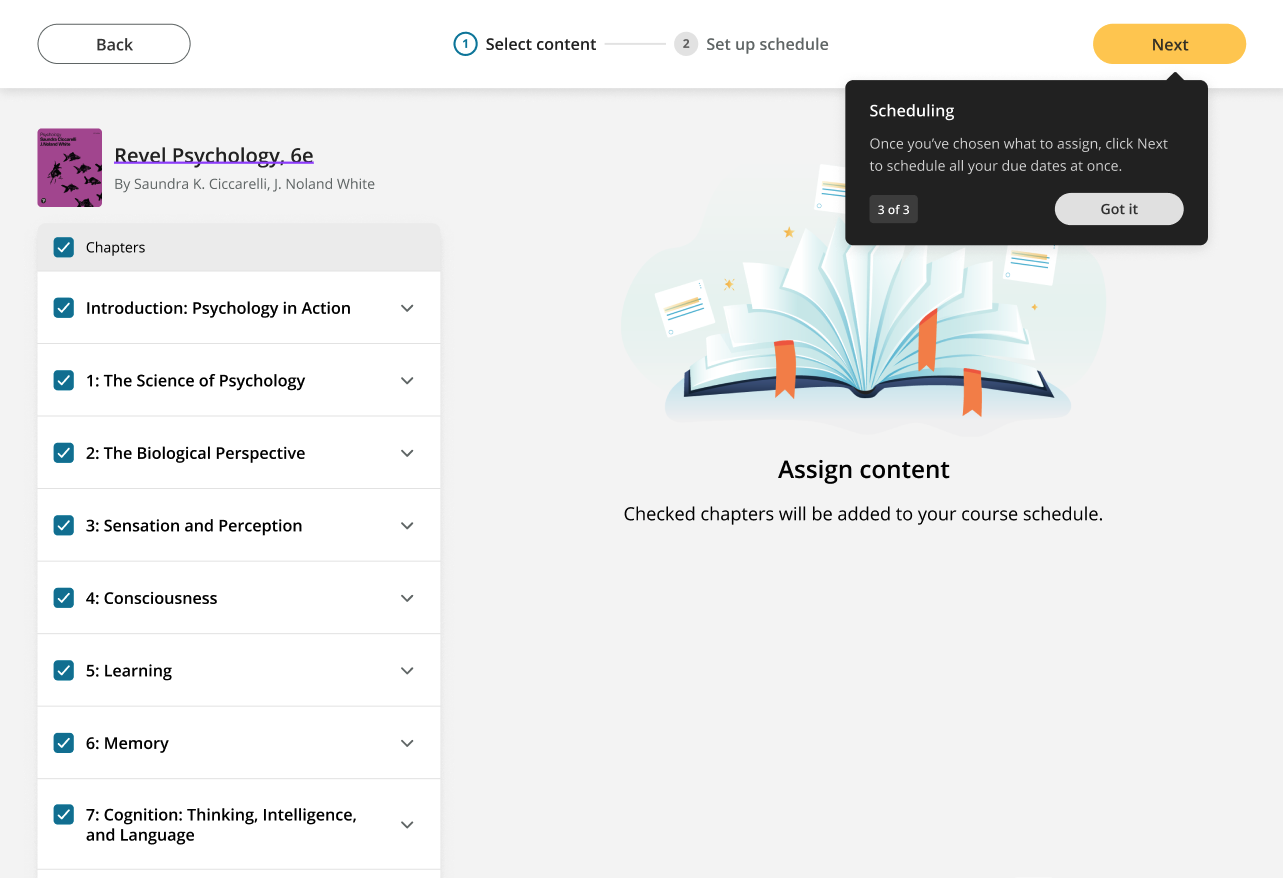
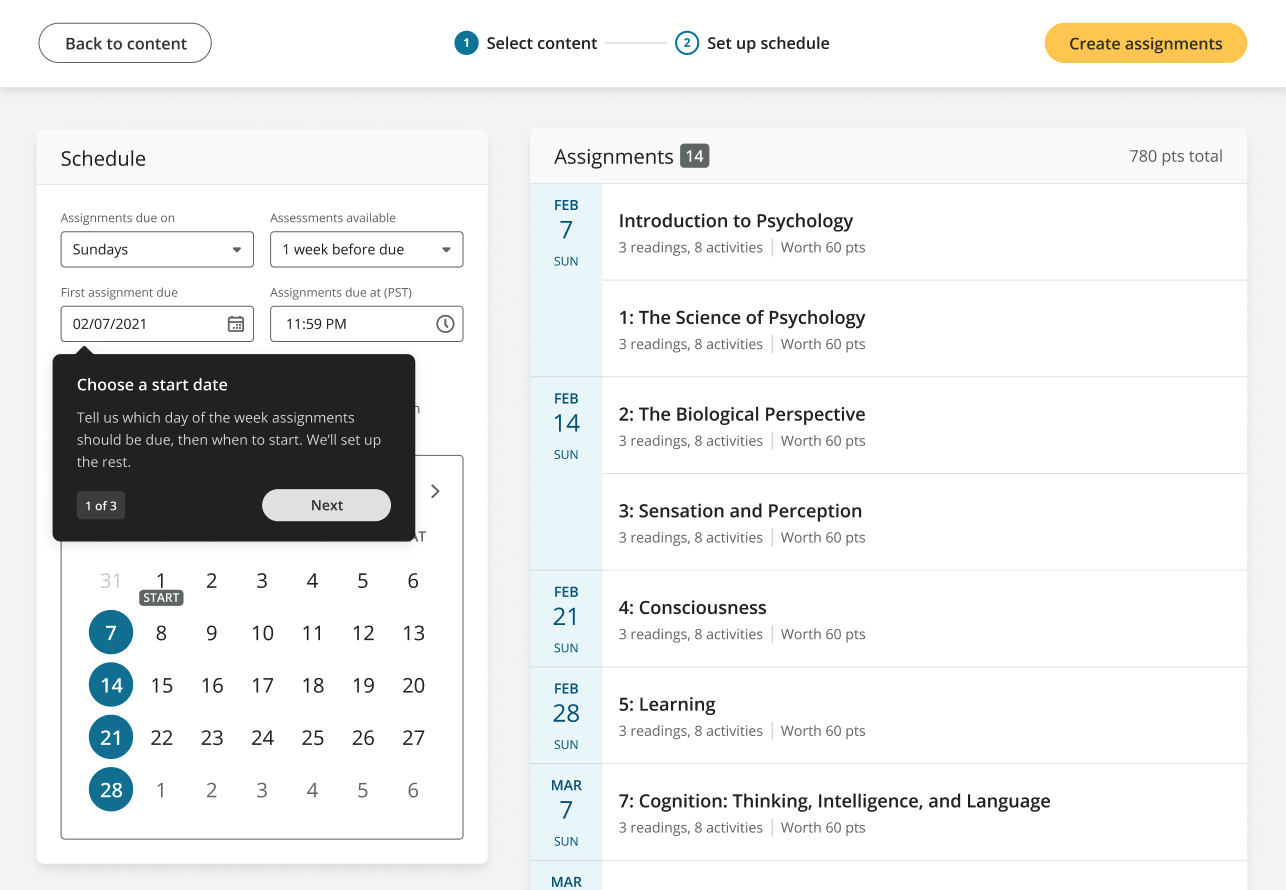
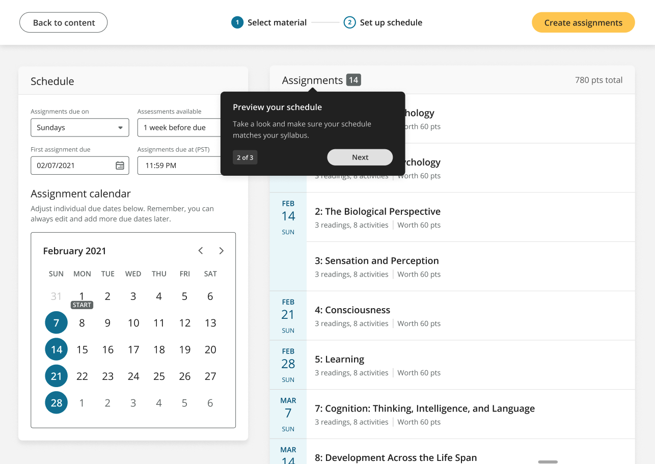
After working with designers on the new UI’s microcopy, I turned my attention toward building a series of unboxing tooltips and coachmarks that would introduce instructors to quick setup. My main goals:
Present the user with quick setup in a way that demonstrates value and anticipates potential concerns
Guide the user through an unfamiliar process succinctly
Work within Revel’s limitations in a way that makes them invisible to the user
The flow
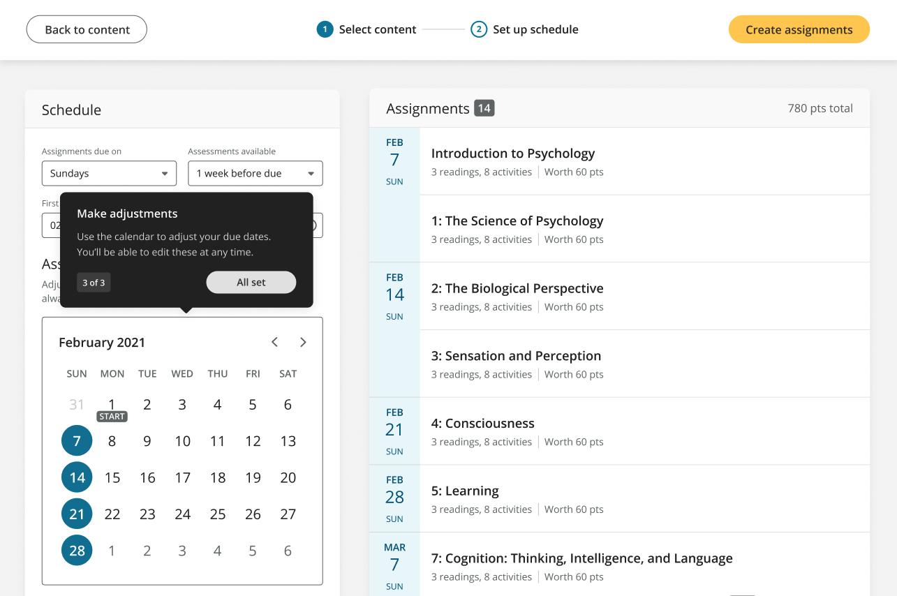
Making some tweaks
No first pass is perfect, and the dev and product teams realized quickly that we needed additional messaging to smooth over some quirks.
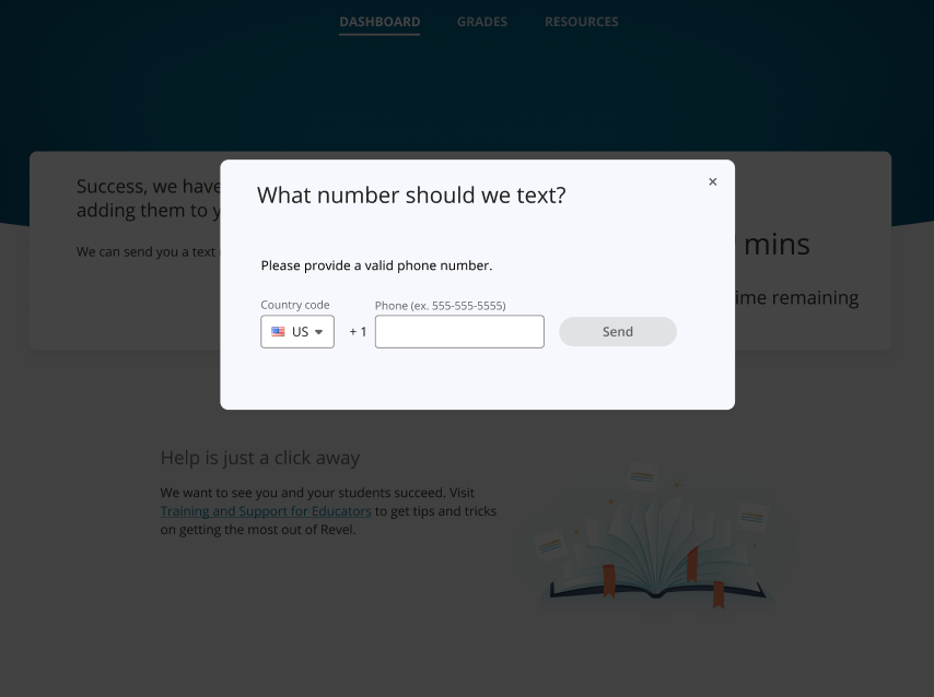
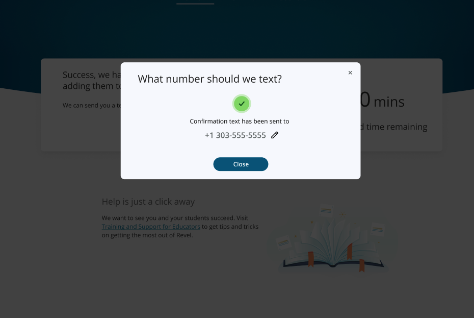
Issue 1: long wait times
Real world testing showed that creating assignments en masse could take seconds—or hours. And there was no way to estimate which it would be.
To remedy this, I worked with designers to build a secondary dashboard empty state that users would encounter after creating their assignments in bulk. They could wait, or leave Revel entirely and get a text message when their course was ready. And, at the bottom, I included easy access to support.

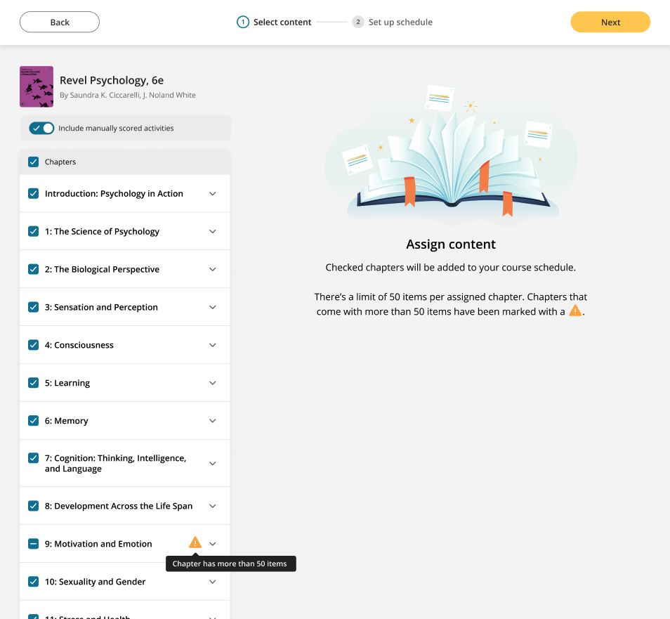
Issue 2: assignment maximums
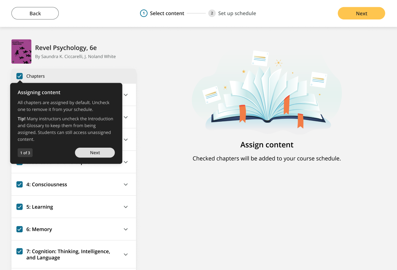
Chapters in Revel are made up of smaller sections, each with their own activities, quizzes, short answer questions, and more. In-house, we call them assignable units, or AUs.
In the old version of assignment creation, Revel capped AUs at 50 per chapter. But because we have a few texts in our catalog that come with way more than 50—and because quick setup assigns all available AUs by default—we needed messaging to let instructors know that they need to pay more attention to the contents of certain chapters.
We didn’t want this new info to be dismissible, and it didn’t fit any of our existing error patterns, since the user could continue without fixing it.
In the end, I included the new info in the empty state and worked with the designer to create a visual indicator for the problem chapter. It will only show up when a chapter has hit the limit.