Bridging two Pearson+ products
• ux writing •
Context
Pearson+ is a web and mobile product intended for undergraduates. It includes selection of sub-products, like the eTextbook reader.
Recently, we acquired a new product, called Channels, to add to the Pearson+ family. It includes a wide range of video explanations and practice questions that can be synced up to a student’s course or textbook.
The ask
Pearson+ users spend most of their time in the eTexbook reader, and while Channels was given a prominent place on the P+ home screen, we weren’t seeing the traffic we expected.
The product team asked us to figure out a way to integrate Channels into the reader in a way that a) is unobtrusive and helpful, and b) makes it clear what “Channels” is, exactly.
The result
Working with the designer, I created messaging to go with the new features.
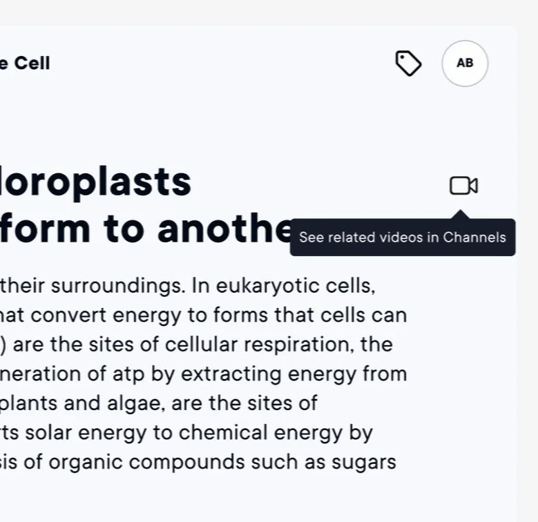
1) A new icon in the upper right corner of the reader, which acts as quick link to relevant content in Channels, as well as a new drawer option.
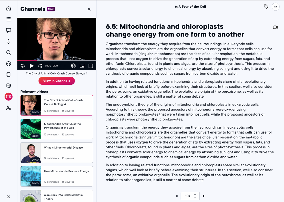
2) A new drawer in the left hand tray, which opens to allow the user to play a handful of the relevant videos and shows them where to find more.
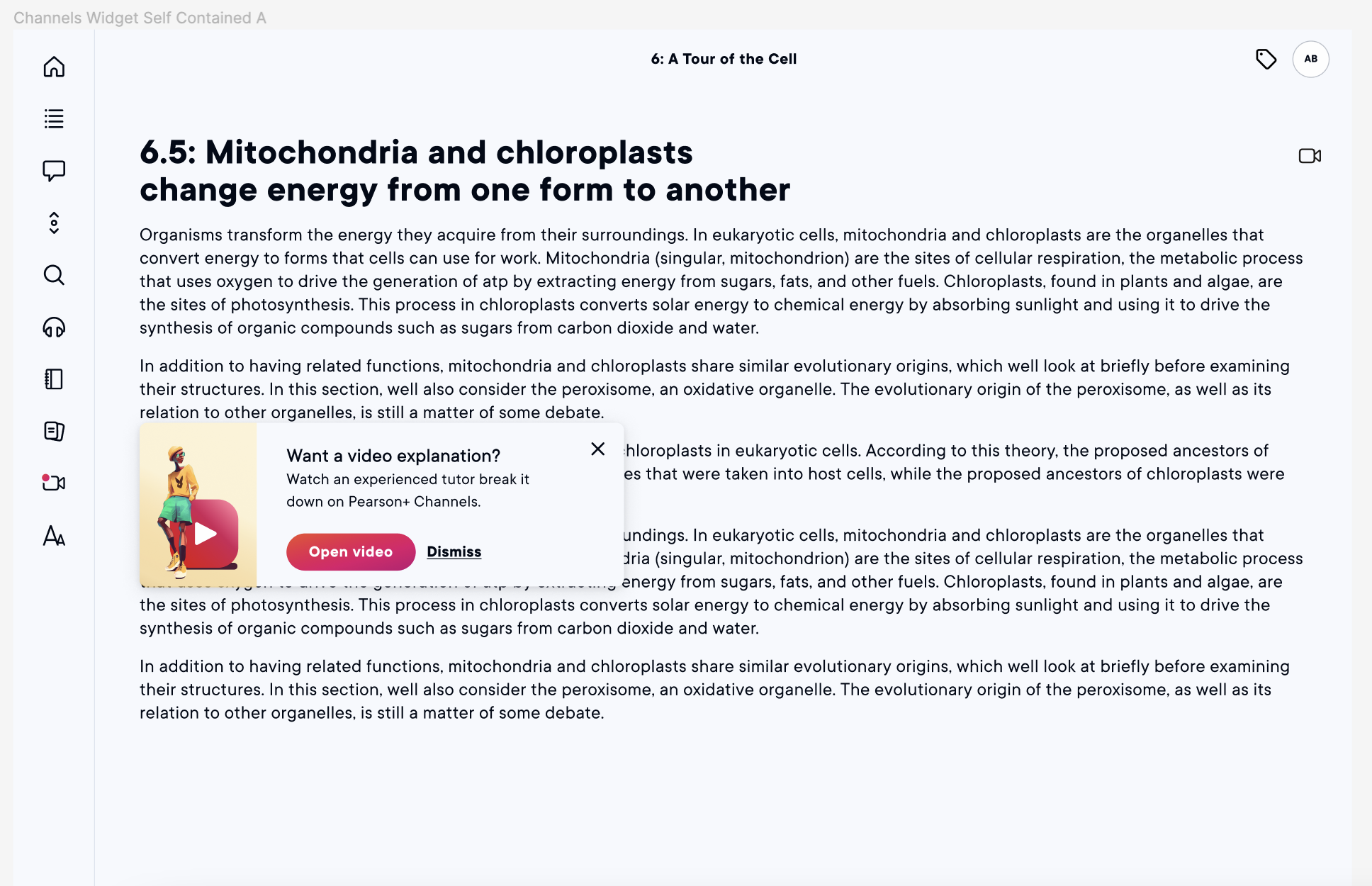
However, all of that messaging still required interaction from the user, which was exactly our problem to start with. We needed something else that would provide them with the context they needed to want to go looking for videos.
We settled on a small, dismissible modal, and to make sure this message is relevant (ie, hopefully not annoying), it only triggers when the session has gone idle and the user returns, with the assumption being that they’re finding it hard to concentrate.