Streamlining a busy modal
content design • ux writing
Context
With Job Match, a career tool for college students, we’ve partnered with Forage, a company that creates real-world work simulations that let users “try out” a job.
The ask
When a user chooses a Forage simulation in Job Match, we need to let them know that they’ll be leaving their current experience and set expectations for their next destination.
The UX designer on this project created a wireframe of the modal with wording from our partners at Forage, then asked me to give the copy a quick once-over. See the left below:
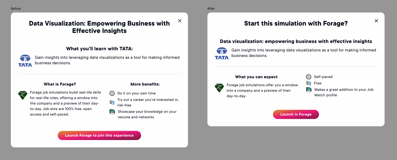
The process
I realized pretty quickly that this modal needed more than a copyedit. It wasn’t scannable, it looked heavy, and the current hierarchy sent readers bouncing around the modal to get the most important info. While we hadn’t tested it (and didn’t have time left in the sprint to) I knew this had the potential to turn into a point of friction that could impact user follow-through.
Instead, I broke the content down and rearranged it (with as little impact to the design as possible, thanks to that tight timeline). Now:
It can be parsed quickly—if the user reads nothing but the main header and the CTA, they still know where they’re going and why they’re going there.
There’s now a clear hierarchy, with the most important info at the top.
The content guides, not sells.
While I can’t say for sure the degree to which this impacted the final results, this modal did NOT turn into a point of confusion, which I consider a win.